|
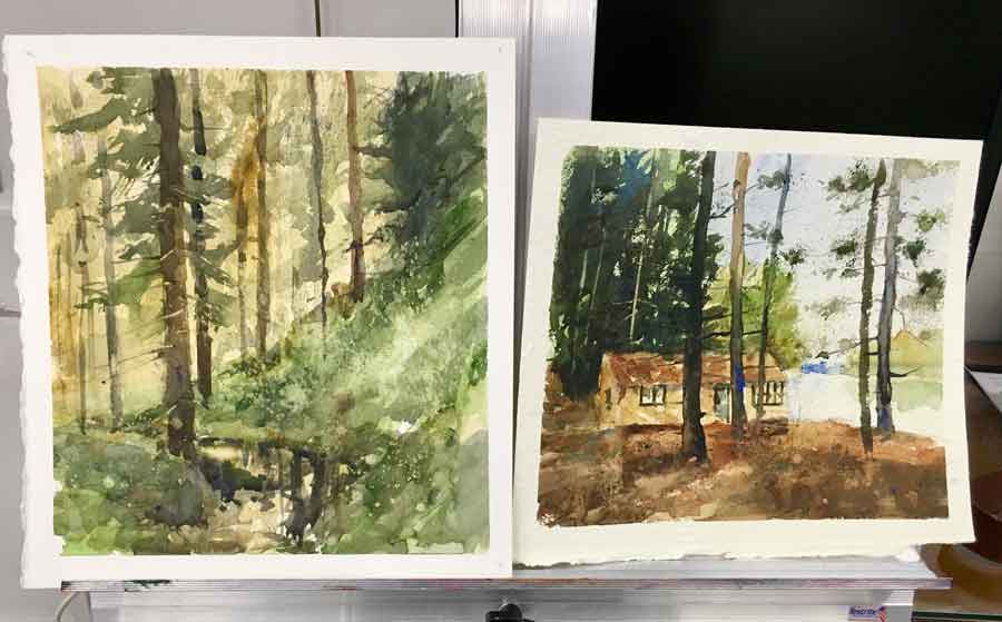
I started this demo off with Indigo paper which is around 240 lb. It has a handmade feeling with a nice rough texture to it. It’s a softer paper, so you have to be careful when lifting—you have to use a soft brush. This full-day workshop was crafted into three demonstrations. I wanted to share the differences of watercolor papers and how to chose your subject material that best suits the watercolor paper. As far as paints I explained to my students what you get out of a limited palette versus a full color. The first two demos took around 45 minutes. Finally, I like to have paint-a-longs because the student catches on faster by watching and then doing rather than just observing. This way I can guide them through the painting and help them through the process. 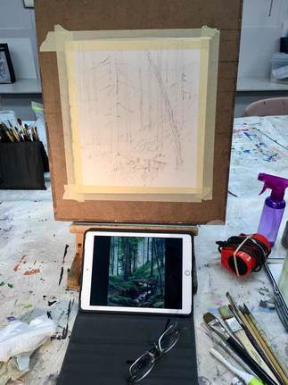 MORNING Demo #1: I started this demo off with Indigo paper which is around 240 lb. It has a handmade feeling with a nice rough texture to it. It’s a softer paper, so you have to be careful when lifting—you have to use a soft brush.
- Raw sienna - Ultramarine blue The limited color approach showed the students using this color palette they could create the illusion of full color. Demo #2: I switched over to 300 lb Arches hot press. It is a smoother and slicker paper. Lifting the paint is easier with this paper. This was a full-color study (note: full color is denoted by six color or more.) Adding just two more colors showed just a hint more variety of colors and helped accentuated temperature changes. Full color:
AFTERNOON The Paint-A-Long: The afternoon demo was on 300 lb Arches cold press. This paper has a rougher surface and can take a good scrubbing. I felt the subject matter lends itself to it – the roughness would add an extra dimension. Finally, I firmly believe in the paint-a-long when teaching students. It’s a step-by-step instruction of how to build a painting. I selected a snow scene to help my students understand how temperature worked with the white of the snow.
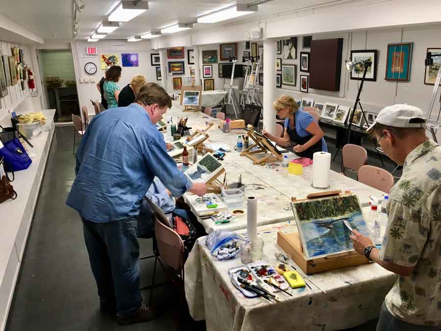
Checkout the great job my students accomplished in just one afternoon. Thank you Next Picture Show for inviting me to your beautiful gallery.
0 Comments
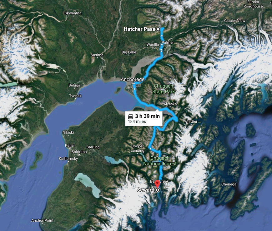
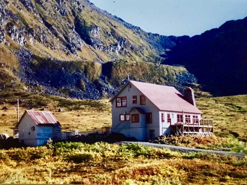
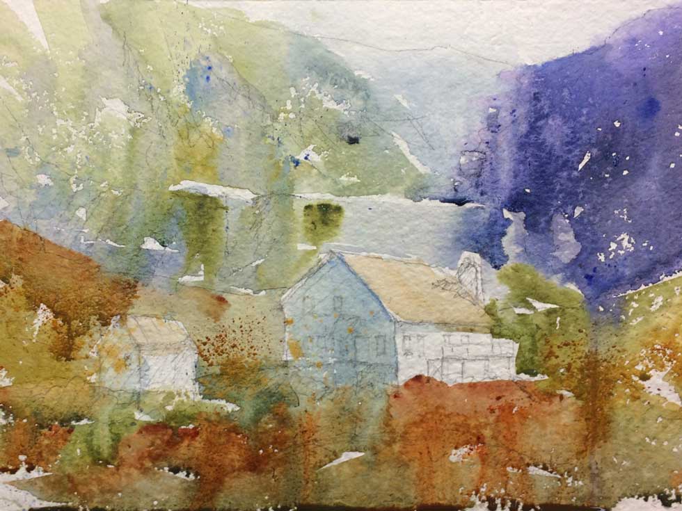
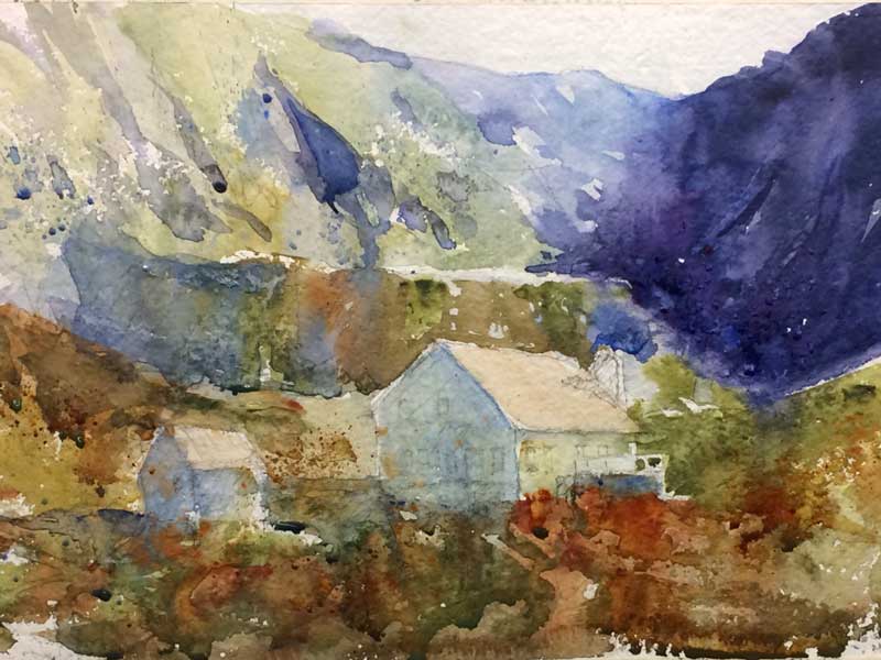
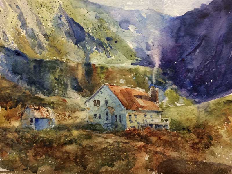
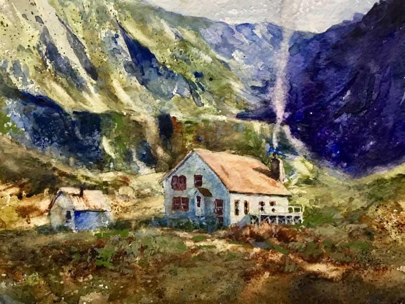
How to Block-In and Cover the Whole Sheet in the First WashThis was a watercolor demonstration I did for my Mainstreet Art Center Wednesday morning watercolor class a few weeks ago. I have a great group of students, a mix of beginners and intermediates who truly love the process of learning and creating watercolor paintings. From start to finish I took approximately 1-1/5 hours of painting/lecture time. The point I wanted to drive home to my class was to be fearless and lay color down, blocking the entire sheet in the first wash. I have my students work with one-quarter of a sheet of watercolor paper till they build up the confidence and experience for a larger painting. This particular painting I used Kilimanjaro 300 lb. cold-pressed off-white natural paper. This is an excellent paper to work with. I have had a lot of success instructing my students with a paint-along demos. This way they watch what I do in step 1: the block-in and they then can recreate it while I am with them answering questions. I remember there was nothing more frustrating to watch my instructor create a painting from start to finish and then turning us loose, try to recreate the same painting or subject matter later that day and forget how he handed the block-in, establishing secondary masses and the final details. The Photograph The photo I used for this watercolor painting was taken during a ten-day trip with my brother, Lee, his wife, Margo, and Marilee. We flew to Alaska around the end of August 2006. We decided to drive through the interior of Alaska instead of a cruise. This way we could experience all the sights, textures, and get an intimate view of the local color. We landed in Anchorage and traveled south to Seward enjoying this coastal town and spending the night in a quaint log cabin. The next day we took a daylong cruise and was totally in awe of the fjords and icebergs. From there we headed back north to Anchorage for the State Fair, Farmer’s Market, and the Anchorage Museum to see the works by Sydney Laurence, American Landscape painter. Then north to Wasilla and Fishhook. This was a portion of our trip. Denali and our plane trip around Mt Mckinley is for another time. This image was taken up by Hatcher Pass in early September which was during the peak of their autumn at an abandoned gold mine.. We took a beautiful drive along Willow Fishhook Road and then Hatcher Pass Road to get there. In fact this was one of the last pictures I took with my trusty Minolta film camera. Shot 20 rolls of film. Marilee shot over 2000 with her new Nikon D200 DSLR. Hatcher Pass is a mountain pass through the southwest part of the Talkeetna Mountains, Alaska. It is named after Robert Hatcher, a prospector and miner. To learn more about Hatcher Pass CLICK HERE. Step #1: The Block-In I started with a pencil drawing lightly, sketched onto the watercolor paper. I recommend a 2B pencil. Don’t go crazy drawing every detail, just lay down the basic shapes making sure your perspective is spot-on. Get it right in the pencil drawing because it will be very difficult if near impossible to correct later. I shared with the students how to block in this particular subject matter with the background coming to the middle ground and then the foreground. I painted around the buildings at first. Then went into the buildings to cover the painting completely. The colors used were:
STEP # 2: Establishing Secondary Masses The second pass at the painting I went back to the mountains in the background starting to form the secondary shapes and areas coming towards the foreground and the ledge behind the buildings. I then went into the foreground trying to keep the background cooler and grayer and the foreground warmer and more intense. Altering the temperature in your painting helps you with aerial perspective. STEP # 3: Slowing the Process Way Down – The Final Details The third phase of the painting I started to develop the background to show more changes in value and modeled the slopes softening the middle area of the mountains. Then I came down to the ledge directly behind the buildings and began modeling the darker darks within that ledge to separate it from the background. I start to develop highly textured areas in the foreground. Working into the building, establishing value changes from the light side of building to the dark side, the cast shadow created by the building, and a small path for interest. I continued adding some of the detail in the building with windows, smoke coming out of the chimney, and a little bit more detail on the building off to the left. Finally, I went back to the mountains, adjusting values to create some sort of interest in the dark areas off to the upper right. Again revisited the slopes off to the left, modeling a bit more, recreating the carved out earth during the gold rush times. I then began pushing a little more intense color and darker values alongside the ledge in the background to push the building forward. I lighted in the roof of the building through lifting to push it forward from the background. From there I began to model the front deck of the building, the side protrusion from the building and darkening the windows were needed. Adding small accents of darks to the path, out in front on and around the building itself. This completed the demonstration.
|
Dale L Popovich IWSDale is an award-winning watercolorist and teacher passionate about capturing the raw beauty of the American landscape with the fluid stroke of a brush. As you will see, the works selected in his portfolio represent the depth of his holistic approach to painting. You can also learn with this talented and experienced teacher through his workshops, Palette & Chisel, and Popovich Studio classes. Archives
April 2024
Categories
All
|
|
INSTRUCTOR
Palette & Chisel 2024 Workshops & Demos ONLINE LEARNING Watercolor Escape Saturdays TIPS and TECHNIQUES Thursdays ZOOM Palette & Chisel Academy of Fine Arts ADDITIONAL INFORMATION Popovich's Field Journal Newsletter WATERCOLOR ART SUPPLIES Watercolor Paints Watercolor Brushes Watercolor Supplies DALE L POPOVICH IWS LIBRARY Books & DVDs BUSINESS BOOKS LIBRARY Books & Podcasts |
©2024 Dale L. Popovich. IWS, Drawing & Painting TIPS and TECHNIQUES Thursday, In the Comfort of Your own Studio tm, Towering Winds Academy of Fine Arts tm, and Teaching People to Truly See tm All Rights Reserved.
|
|
©2024 Dale L Popovich, Towering Winds Academy of Fine Arts and The Studios of Dale L Popovich IWS. All rights reserved
Copyright © 2024 Rosemary & Co Artist's Brushees LTD |

Handmade and maintained by POPovichDESIGN
[email protected] |



 RSS Feed
