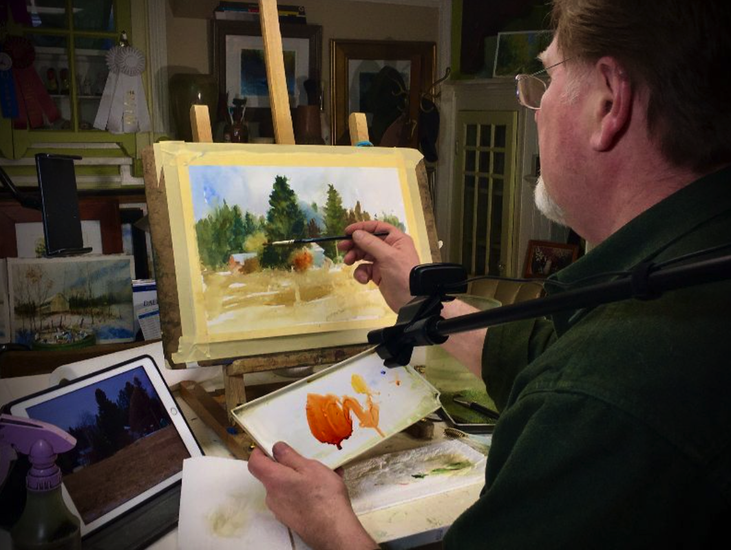
 How to Get Confidence Mixing Greens for Landscape FEBRUARY 13 AND 27, 2021 THIS IS A PAID EVENT: The Watercolor Society of Indiana asked me to conduct a virtual workshop for their organization. Due to COVID, this organization has turned its focus on meeting with its members on Zoom. The next adventure will be offering workshops. I’m honored to have been asked to kick this off for them. Here’s a link to the paid event. Need more info read below. Private message me with questions. Hope to see you there.  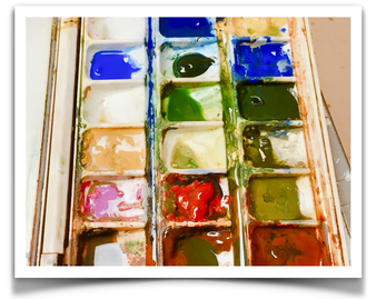 THE DEMO - DAY 1, Feb 13 THE REFERENCE PACKET You will receive a reference packet for our Zoom workshop. This packet includes one of my photos from my personal collection. In addition, I will supply you a pencil sketch on watercolor paper you will recreate on your own paper. Finally, page 3 includes:
 I will talk about how to build a painting. The main emphasis will be on gaining confidence and demystify mixing and using greens. Secondly, is the process. I will explain the block in the method of painting. Working from large to small areas, painting from background to foreground, developing your values from light to dark, and finally working your colors more intensely at the beginning to grind down to a slow process as you work through the painting. 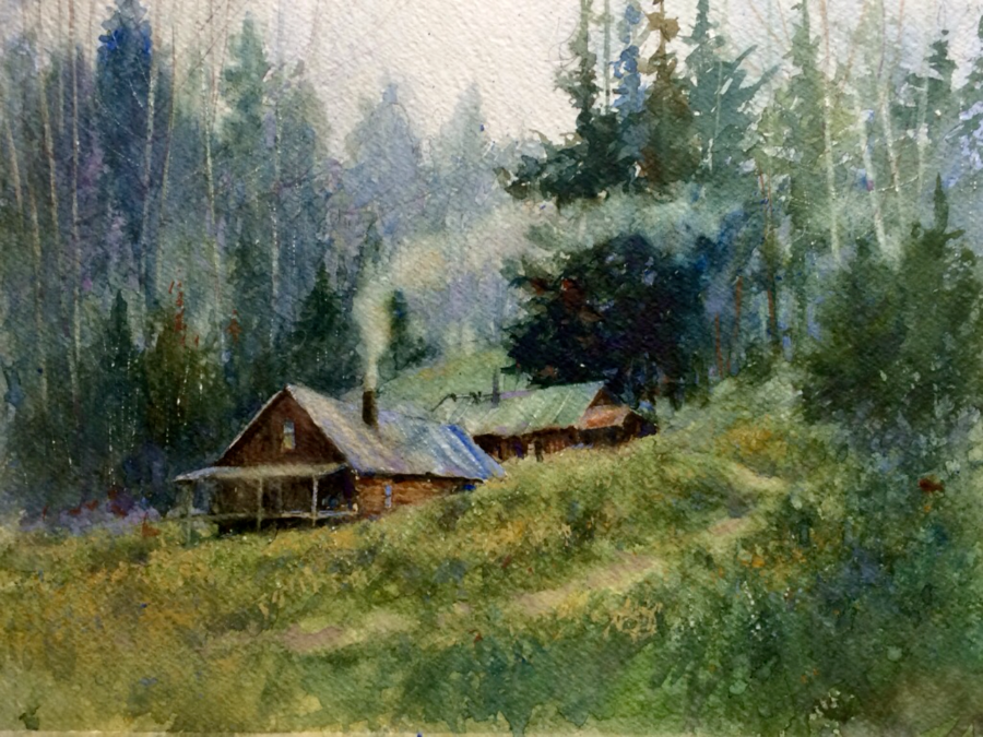 ©Dale L Popovich IWS, Ballet of Smoke There are several things that I will continue to remind you during the demonstration. A few of these are keeping your edges as soft as you can for as long as you can. Understanding various uses of the brush including applications of the toothbrush in applying and removing color.
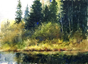
The Photo Marilee, my wife, and I suffer from wanderlust! With empty memory cards, a thermos of steaming hot coffee, and a full tank of gas we headed out to discover new sceneries. In northern Wisconsin during the spring, there are numerous intense colors of green in the forest – yellow-greens to blue-greens where the sparkling sun meets the fog rises from the early morning forest floor. This special swampy area opened into a meadow in the distance. It was a bit mystical to me. There was an ancient fire road directly across the way that led to hiking trails curving through the marshland. As we explored we passed small stagnant ponds and disfigured trees that almost seemed to wave at us as we passed by. This was a perfect spot calling to be painted. 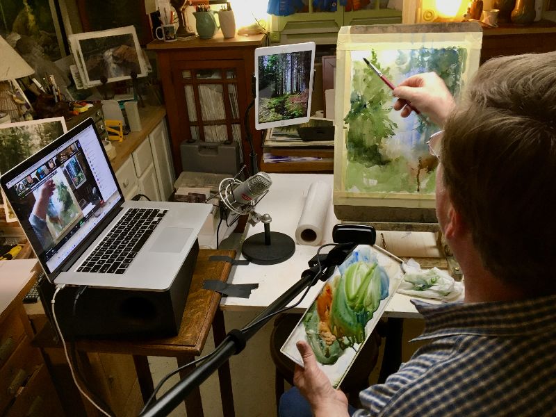 THE VIDEO This demonstration will be recorded so you can recreate what I painted. You will receive an email approximately three to four days after the demo with a video link. This video is yours along as YouTube is around. In addition, you will receive a Start-to-Finish packet that includes photos of each step along the painting process. If you have any questions before the critique please send me an email and I will answer them. 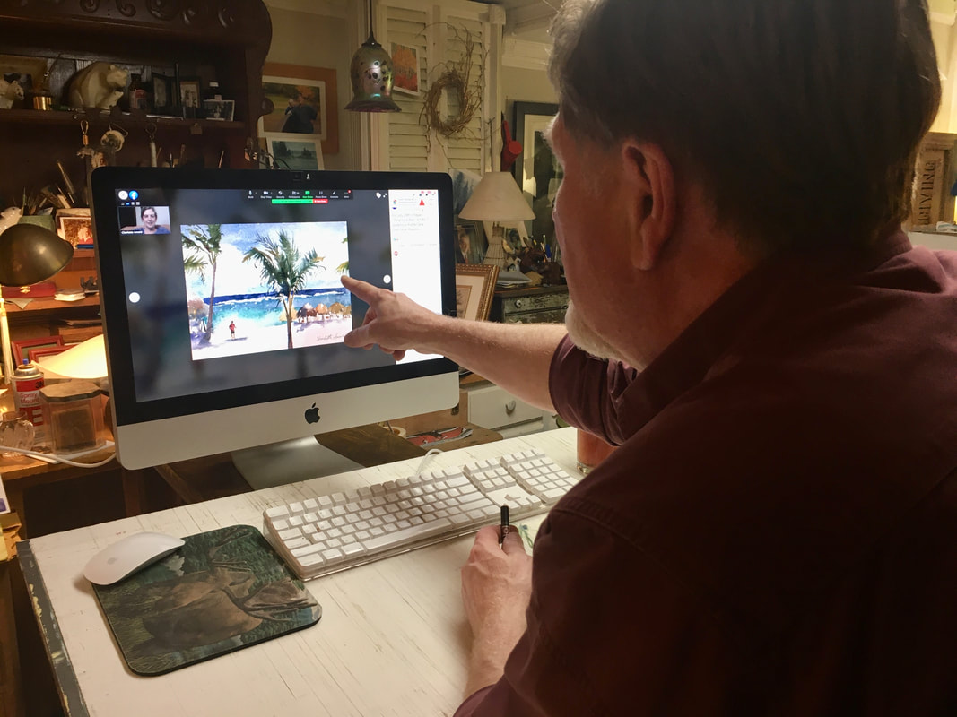 THE CRITIQUE – DAY 2-Feb 27 Once you have completed your painting email it to me by Noon Friday, February 26, 2021. Here's What to Expect:
0 Comments
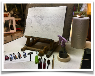
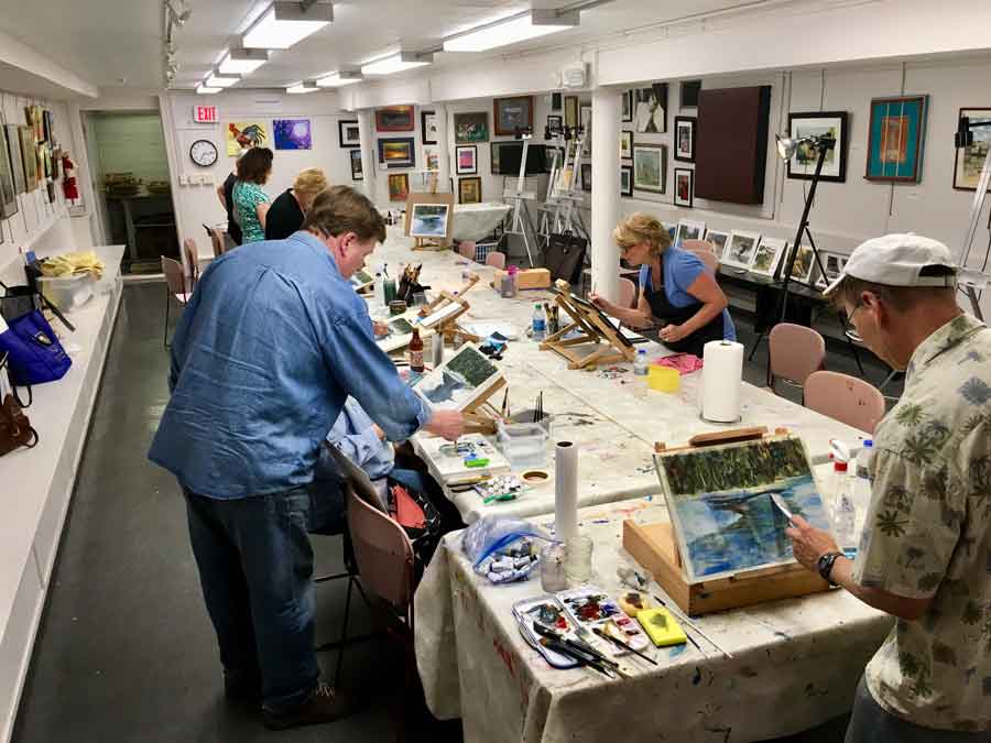
 I started this demo off with Indigo paper which is around 240 lb. It has a handmade feeling with a nice rough texture to it. It’s a softer paper, so you have to be careful when lifting—you have to use a soft brush. This full-day workshop was crafted into three demonstrations. I wanted to share the differences of watercolor papers and how to chose your subject material that best suits the watercolor paper. As far as paints I explained to my students what you get out of a limited palette versus a full color. The first two demos took around 45 minutes. Finally, I like to have paint-a-longs because the student catches on faster by watching and then doing rather than just observing. This way I can guide them through the painting and help them through the process. 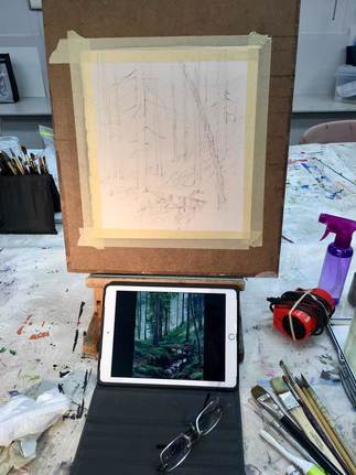 MORNING Demo #1: I started this demo off with Indigo paper which is around 240 lb. It has a handmade feeling with a nice rough texture to it. It’s a softer paper, so you have to be careful when lifting—you have to use a soft brush.
- Raw sienna - Ultramarine blue The limited color approach showed the students using this color palette they could create the illusion of full color. Demo #2: I switched over to 300 lb Arches hot press. It is a smoother and slicker paper. Lifting the paint is easier with this paper. This was a full-color study (note: full color is denoted by six color or more.) Adding just two more colors showed just a hint more variety of colors and helped accentuated temperature changes. Full color:
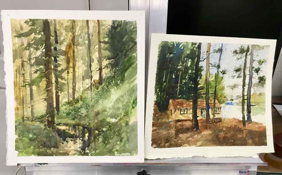 LEFT: Limited color RIGHT: Full color AFTERNOON The Paint-A-Long: The afternoon demo was on 300 lb Arches cold press. This paper has a rougher surface and can take a good scrubbing. I felt the subject matter lends itself to it – the roughness would add an extra dimension. Finally, I firmly believe in the paint-a-long when teaching students. It’s a step-by-step instruction of how to build a painting. I selected a snow scene to help my students understand how temperature worked with the white of the snow.
 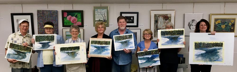 Checkout the great job my students accomplished in just one afternoon. Thank you Next Picture Show for inviting me to your beautiful gallery.
 Just recently my wife turned me onto a great podcast called Artist Helping Artist. The host, Leslie Saeta and her co-host Margaret Sheldon discuss a specific topic that addresses how to sell more art on-line, along with guest artists, gallerists, and others sharing their knowledge of the business side of art. Marilee said these two ladies are so on trend with social media and marketing. I personally enjoyed their talks with famous artist like Doug Diehl and Stapleton Kearns. In fact Stapleton Kearns will be judging the Indiana Heritage Art Show in Nashville, IN this year. One warning once you start listening you won't be able to stop! 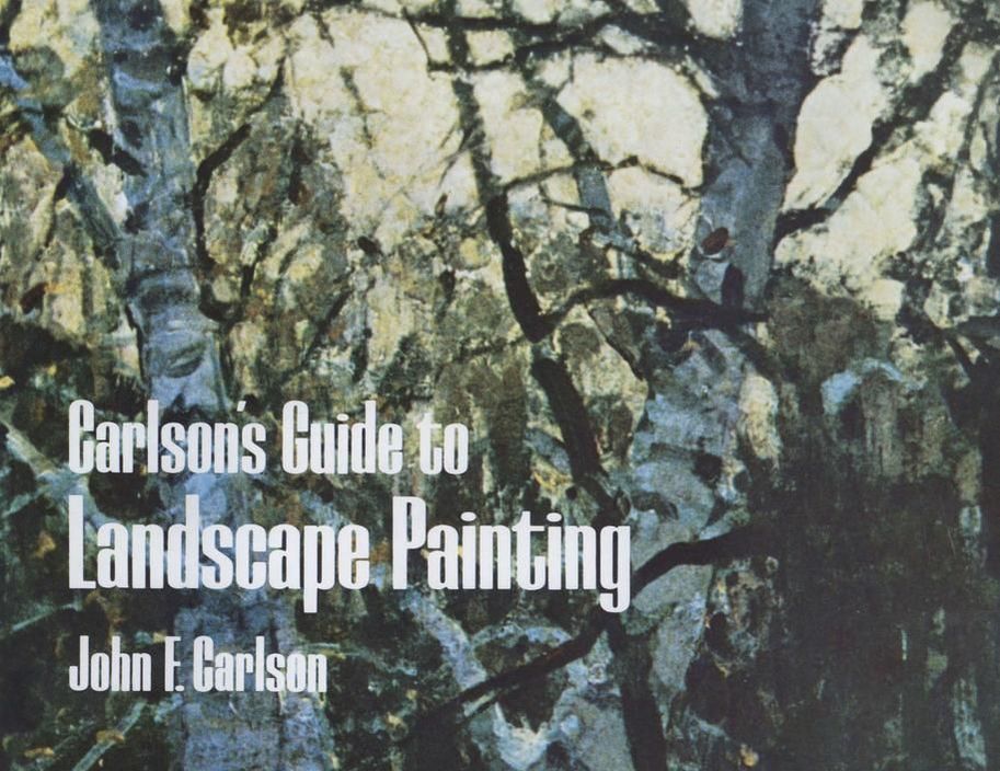 Last week Leslie and Margaret share their feelings about John F Carlson book Carlson's Guide to Landscape Painting.. As you all know hands down this is my favorite art books of all time. Even though I am a watercolorist and Carlson worked in oils I feel it has valuable information about drawing, painting, perspective, atmosphere and so much more. On their show, they mention some of the key ideas from the book... they hope that this will cause their audience (and mine) to reread it or purchase it for your art book collection. It's amazing a book that is nearly 100 years old still holds up. The podcast is about an hour so listen to it while you are driving or taking a little time for yourself. CLICK HERE TO LISTEN.
The book is easy to find –you can buy a soft cover, spiral bound or for a Kindle at book at AMAZON. If you own an iPad, like I do you can purchase for an iBook at APPLE'S ITUNE STORE. Yesterday, Saturday, February 17 In conjunction with our Faculty Show at the historical Palette & Chisel Academy of Fine Arts in Chicago I along with other instructors offered free demonstrations. I demonstrated a watercolor and this demo was broadcasted on Facebook Live. Don't forget to LIKE OBSERVER ARTIST WATERCOLORIST DALE L POPOVICH IWS on Facebook.
If you missed this amazing event mark your calendar for early next February 2019. Here’s all the demos that took place at the P&C. February 17, 2018 Main Gallery 10 - 12 pm: Larry Paulsen - Drawing Facial Features 1 - 4 pm: William Schneider - Portrait Painting Second Floor 10:30 am - 12 pm: Dale L Popovich - Watercolor February 24, 2018 Main Gallery 10:30 am - 12 pm: Helen Oh - Still Life in Oils 1 - 4 pm: Michael Van Zeyl - Still Life in Oils Second Floor 9 am - 3 pm: Steve Puttrich - Watercolor 10 am - 12:30 pm: Lenin Delsol - Portrait Painting FACULTY SHOW Exhibition: February 9 - 26 Palette & Chisel Academy of Fine Arts Address: 1012 N Dearborn St, Chicago, IL 60610 Phone: (312) 642-4400 paletteandchisel.org 1012 N. Dearborn • Chicago IL 60610 • P (312)642-4400 • F (312)642-4317 • [email protected] Office Hours Monday-Thursday • 10:30am-6:30pm • Friday 10:30am-5:00pm • www.paletteandchisel.org MAP 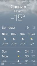 I had a great turnout for the LOLA Land 'O Lakes Arts All-Day Workshop. I was amazed at the turnout because the day was quite chilly, -15. But then I remembered the folks up north are of hardy stock. Weather doesn't stop them. The class was made up of beginners and intermediates. LOLA has quite a great reputation to offer quality class for all ages thanks to WENDY POWALISZ, Programming Director. Wendy said there had been great interest in a drawing class with a focus on simple perspective. So I created a specially tailored workshop just for them called Learn How to Draw Structures Fast and Easy, Then Paint in Full-Color Watercolor. First half of the day I demonstrated and shared basic linear perspective theory with simple structures. They also learn two-point perspective and recreated what I shared with them by creating simple drawings. In the second half of the day the class applied the knowledge in a transparent watercolor painting. During this session they developed a snow scene using the two-point perspective from the morning. They gained an understanding of working from foreground to background, large to small and temperature changes in the snow scene. The day flew by, lost of questions were asked and my final watercolor demo painting was raffled off. Thanks LOLA for another great workshop. From there I went back to our cabin, talked about my day with Marilee and took my best girl out for dinner. Life is good.  |
Dale L Popovich IWSDale is an award-winning watercolorist and teacher passionate about capturing the raw beauty of the American landscape with the fluid stroke of a brush. As you will see, the works selected in his portfolio represent the depth of his holistic approach to painting. You can also learn with this talented and experienced teacher through his workshops, Palette & Chisel, and Popovich Studio classes. Archives
April 2024
Categories
All
|
 RSS Feed
|
INSTRUCTOR
Palette & Chisel 2024 Workshops & Demos ONLINE LEARNING Watercolor Escape Saturdays TIPS and TECHNIQUES Thursdays ZOOM Palette & Chisel Academy of Fine Arts ADDITIONAL INFORMATION Popovich's Field Journal Newsletter WATERCOLOR ART SUPPLIES Watercolor Paints Watercolor Brushes Watercolor Supplies DALE L POPOVICH IWS LIBRARY Books & DVDs BUSINESS BOOKS LIBRARY Books & Podcasts |
SHOP
©2024 Dale L. Popovich. IWS, Drawing & Painting TIPS and TECHNIQUES Thursday, In the Comfort of Your own Studio tm, Towering Winds Academy of Fine Arts tm, and Teaching People to Truly See tm All Rights Reserved.
|
|
©2024 Dale L Popovich, Towering Winds Academy of Fine Arts and The Studios of Dale L Popovich IWS. All rights reserved
Copyright © 2024 Rosemary & Co Artist's Brushees LTD |

Handmade and maintained by POPovichDESIGN
[email protected] |