|
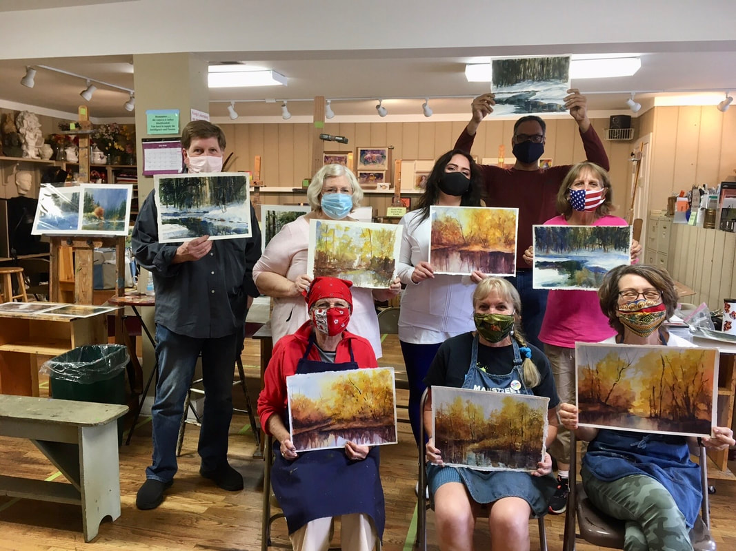
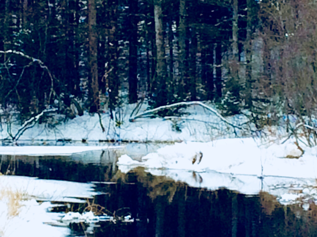
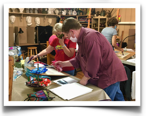
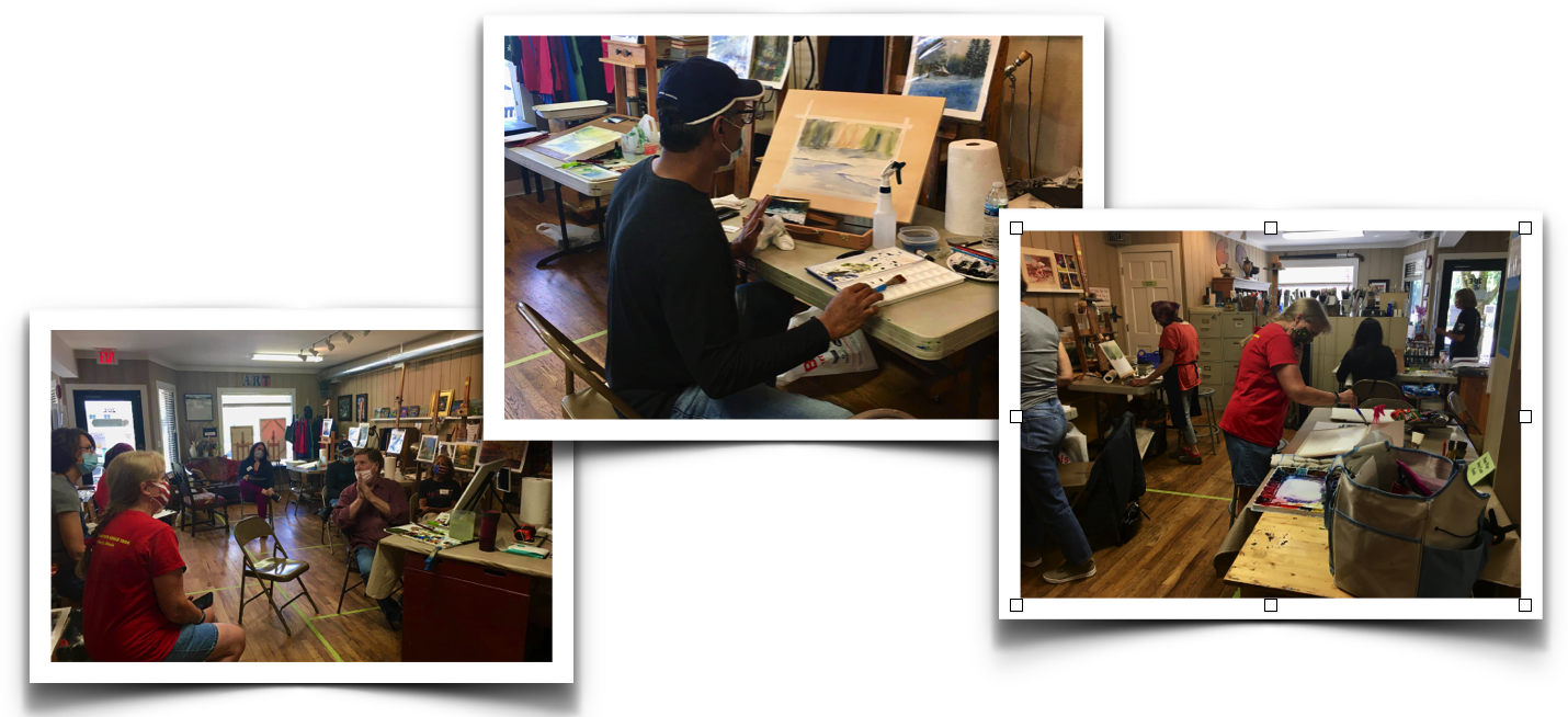
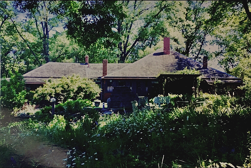
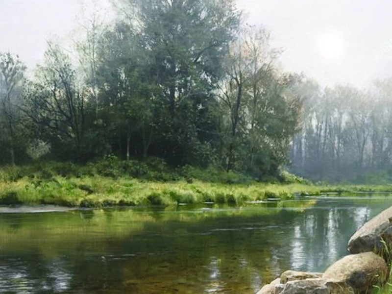
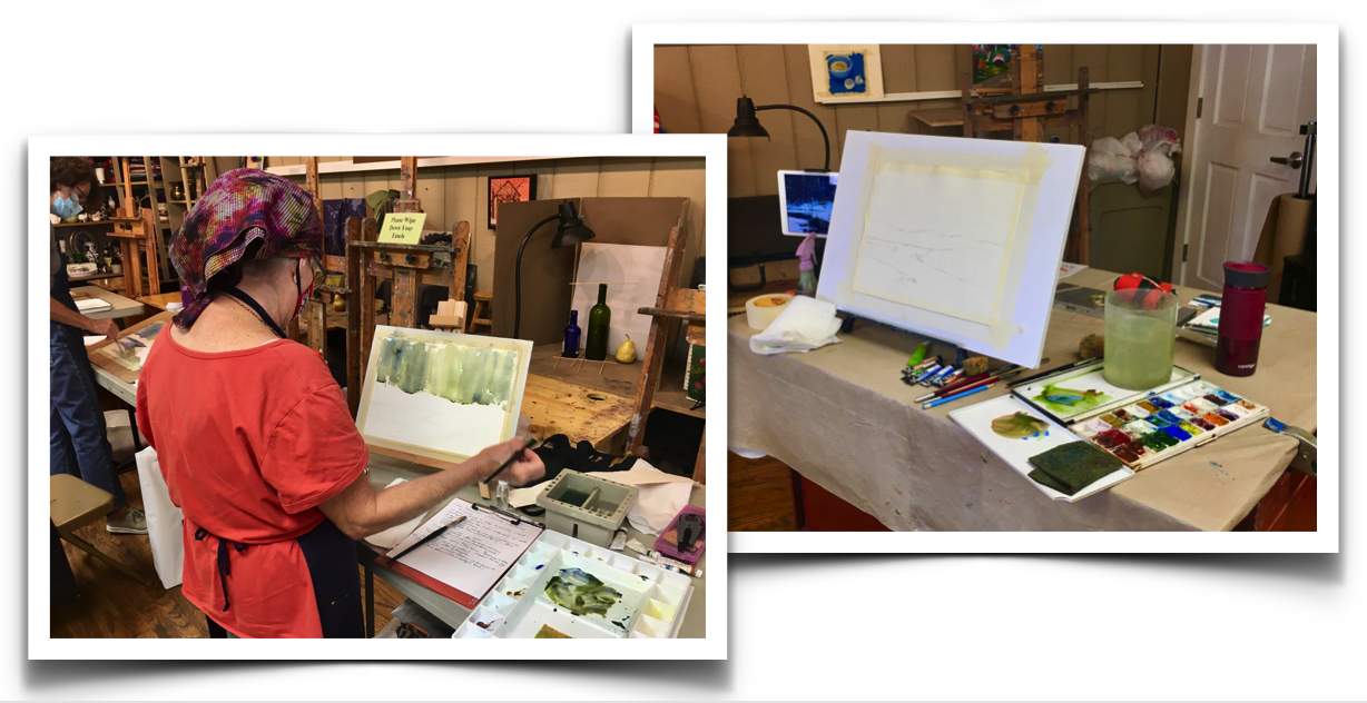
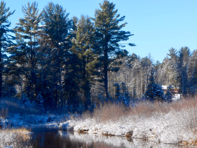
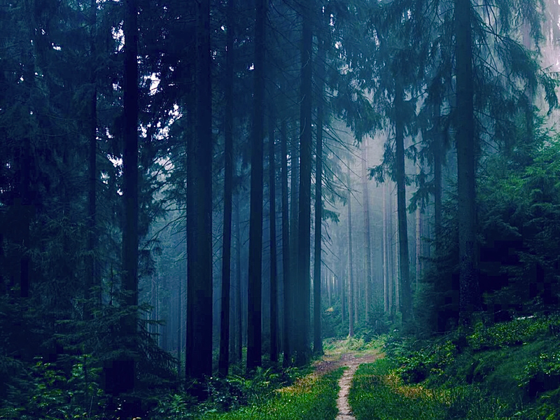
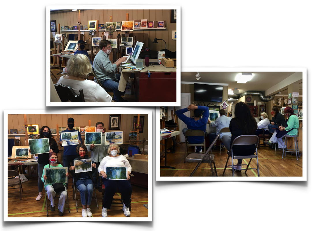
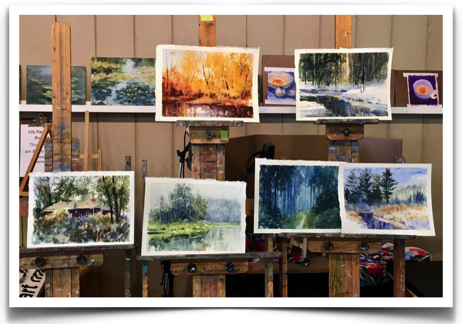
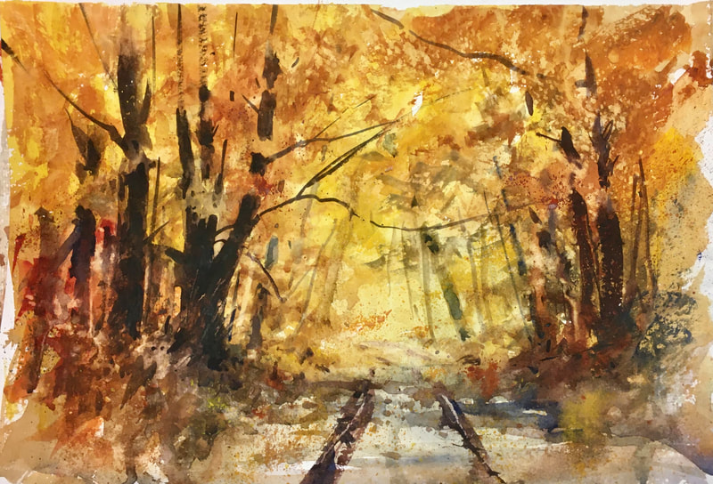
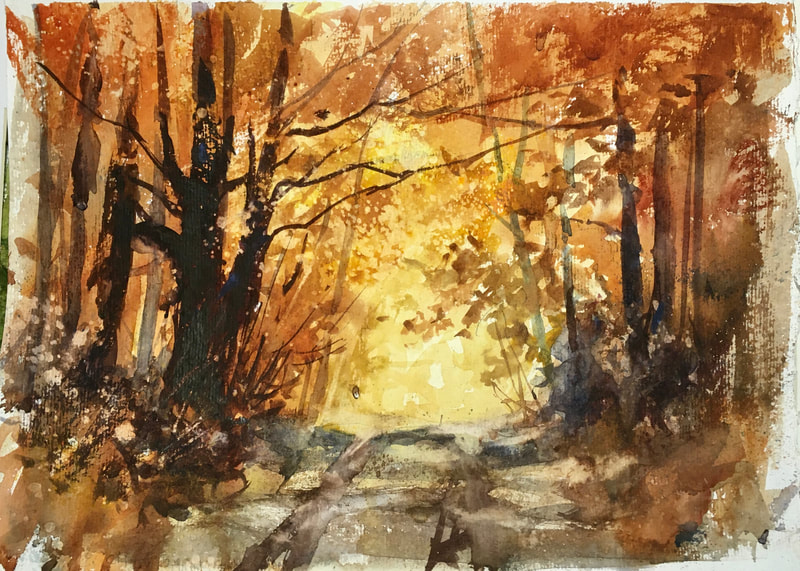
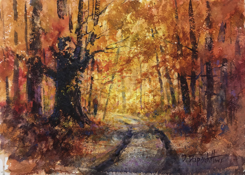
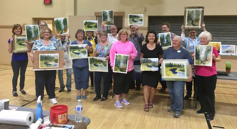
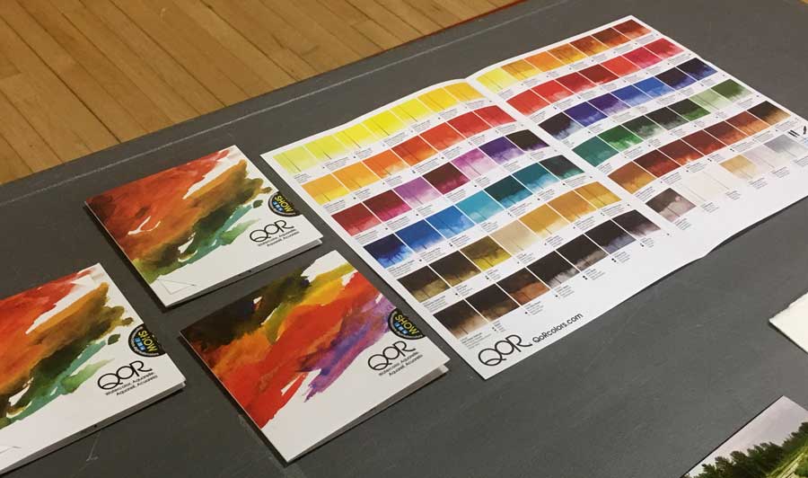
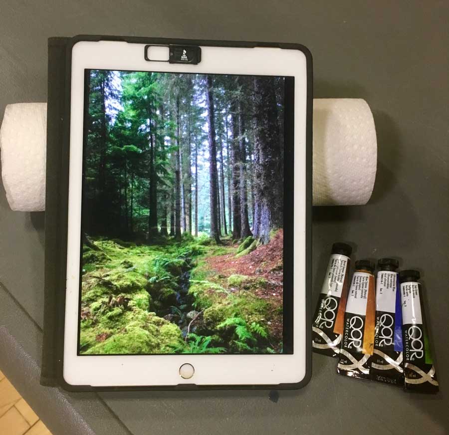
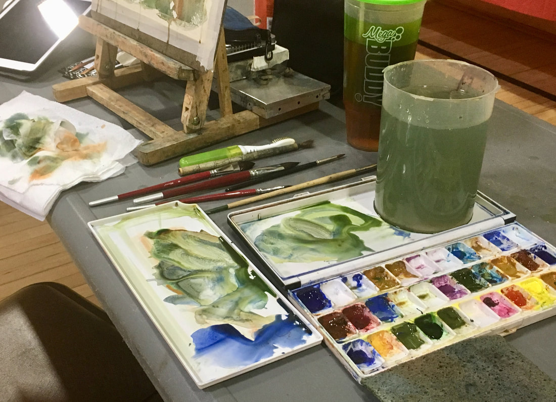
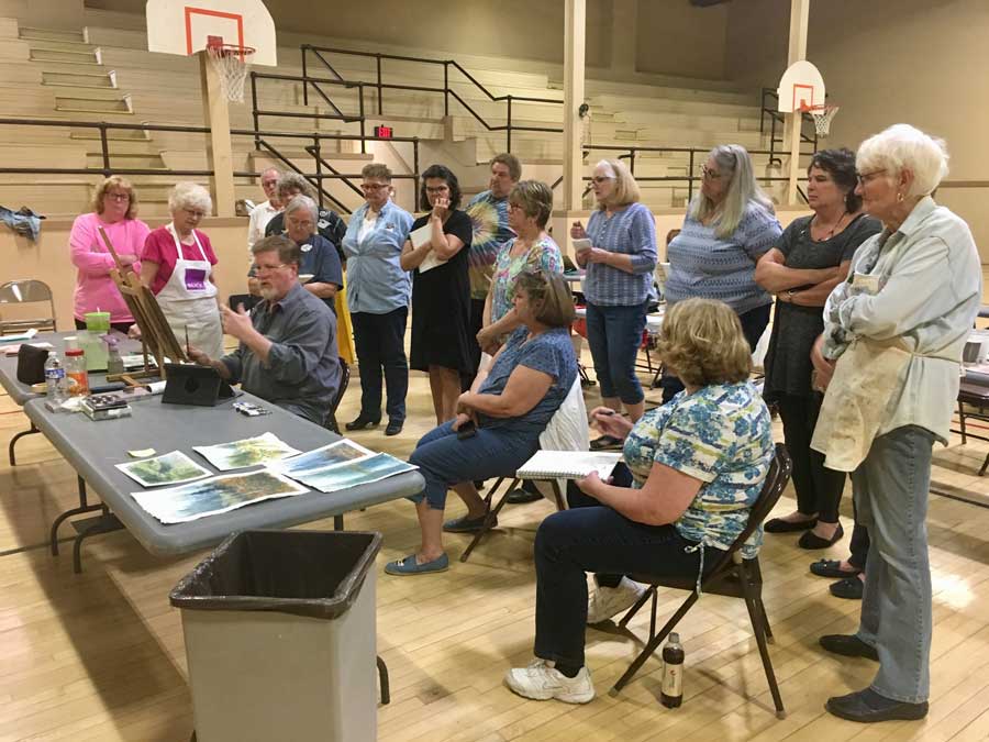
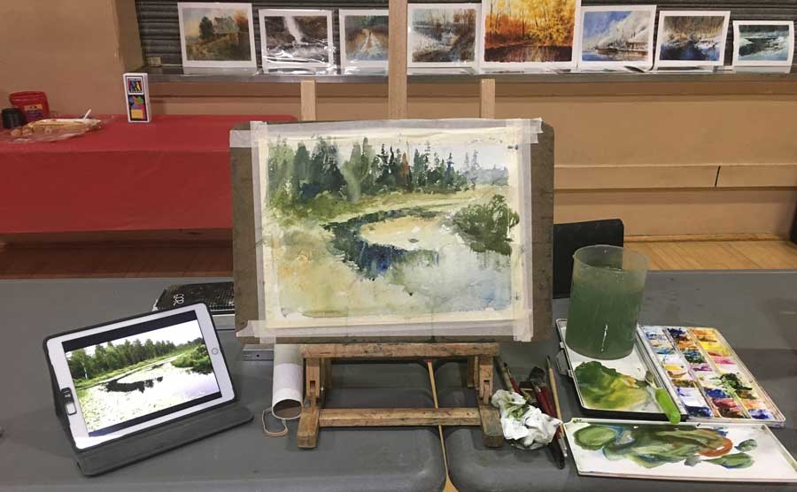
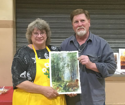
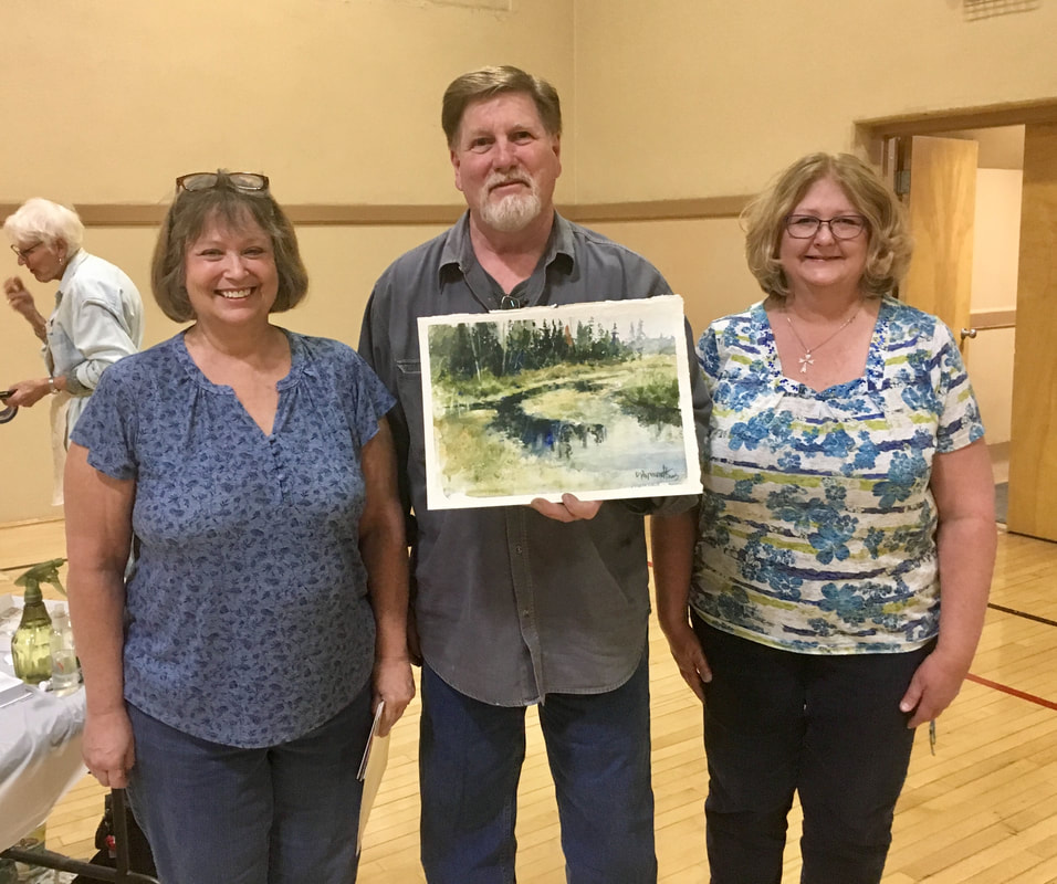
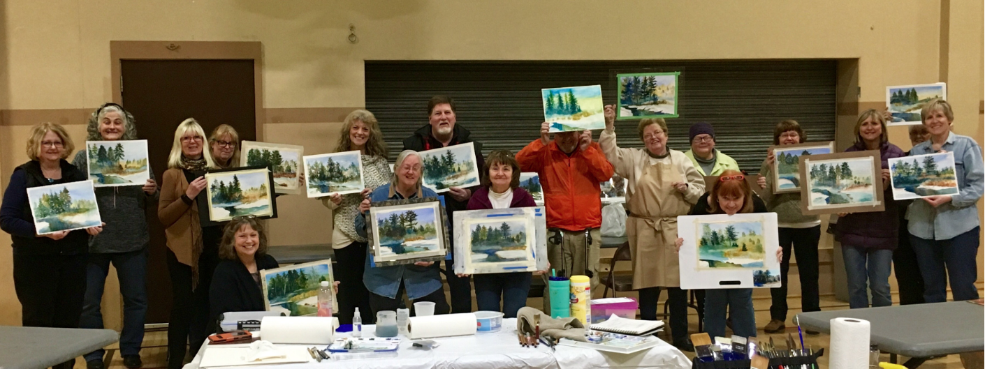
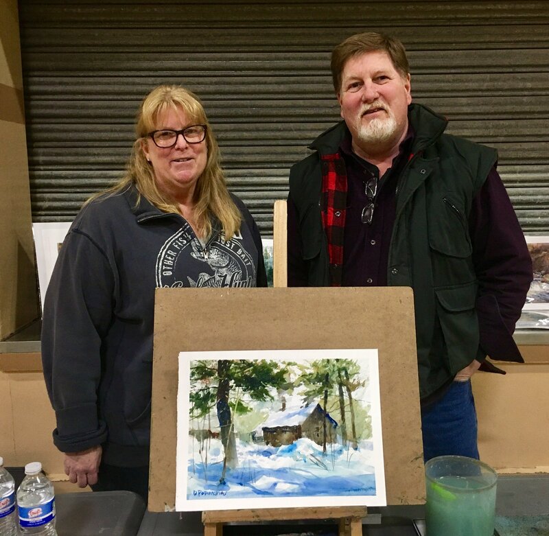
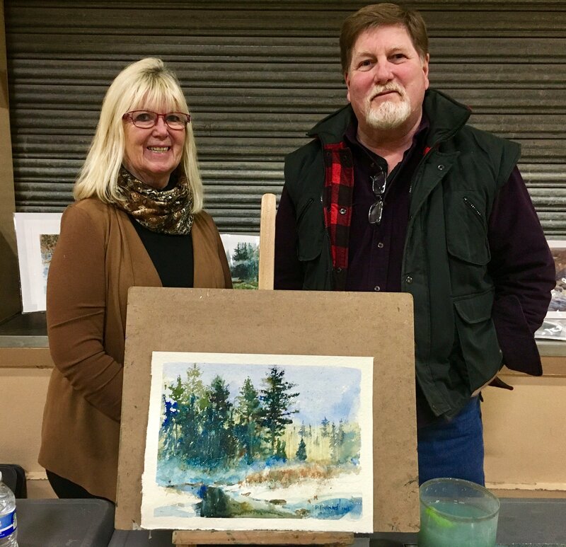
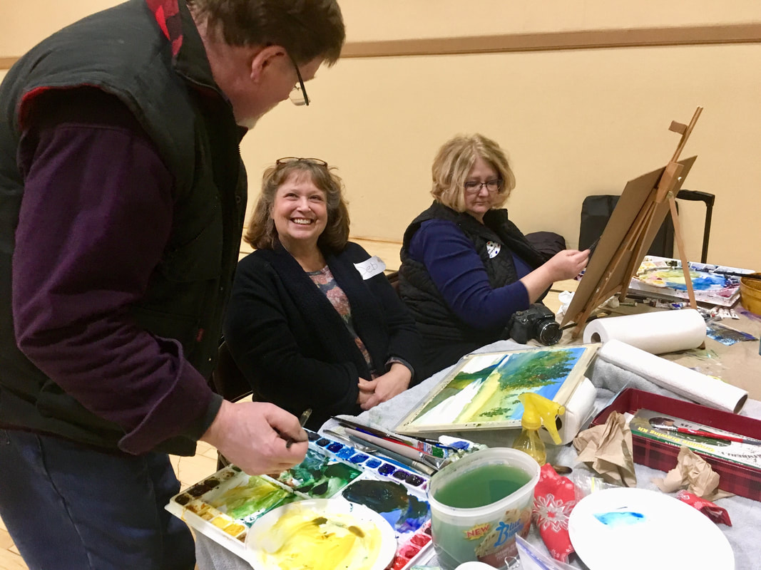
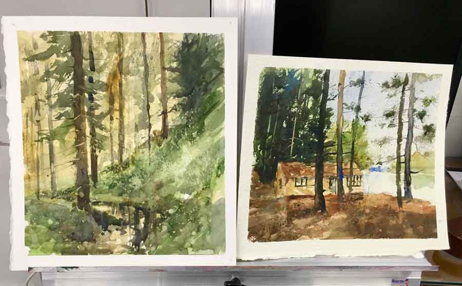
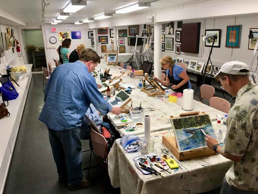
My 3-full day workshop at MainStreet Art Center, Lake Zurich, IL, Abstract Paintings of Nature in Watercolor was finally a go! I had a wonderful time getting back in the teaching "saddle". Because of COVID19, this workshop had been rescheduled several times. But Frankie Johnson, owner of MainStreet and I were bound and determined to have it happen. As you can figure all of my events had been canceled. Marilee and I were incredibly organized this year with scheduling teaching, workshops, shows, and demos This was the weirdest thing to see it vaporize before our very eyes. Besides demonstrating the beauty of watercolor I shared my thoughts about materials and the importance of buying the best products you can afford. One of my students was using a mix of Winsor and Newton Cotman and Grumbacher watercolor paints. Needless to say, she was struggling so I let her try my QoR watercolors and she said "WOW! What a huge difference." I can't stress enough the importance of using professional-grade watercolors. In addition, the same goes for watercolor paper. Only buy 100% cotton. You are asking for trouble if you buy a cheaper grade that contains wood fibers. The paper will pill when you scrub it. My third must-have is real hair brushes If you can afford them. Otherwise a blend of synthetic/real hair. If you take care of them you will keep them for a long time. My series The real hair loads a lot of paint and doesn't wear out like synthetic. My 1" 202 Morrilla is over 40 years old. Unfortunately, it's not made anymore but you may find a used one on eBay. If you would like to see my supply recommendations and list CLICK HERE. Masks on, socially distanced in place, sleeves pushed up to work, learn, and have fun! DAY 1: The morning painting was a snow scene of the beginning of the Wisconsin River (Land O' Lakes, WI) which has been one of my favorite sites to paint, whether it's spring, summer, fall, or winter. The levels of water change as does the foliage, colors, textures, and the influence of light. I call this river home. In this exercise, I wanted to teach how to handle snow and paint anything white. evaluate temperature and not copy the photo. My afternoon demo was a fall scene full of autumnal colors where my students learned the spontaneity of no drawing and following the light and dark patterns. Two paintings completed and so proud of everyone’s first day of work. DAY TWO: The learning and fun continue! Two more were paintings completed. The morning demo was T.C .Steele's house in southern Indiana. During this demo, I wanted to share the ease of drawing a structure and how to incorporate it into a landscape in a simple way. I also shared how to make a very dark subject interesting. The afternoon demo was another scene from the Great Northwoods of Wisconsin. The tranquil water scene was a perfect example to show how to achieve an atmospheric perspective. Pushing the background back and look believable. I also get quite a few requests for the secrets of painting water. I shared my approach to water with just a few brushstrokes. So proud of everyone’s second day of work. DAY THREE: the last day of my 3-full day watercolor workshop. In the morning study, I wanted everyone to learn how to work with high-contrast and minimal drawing. I also wanted to share my techniques of dry-brushing in watercolor. The afternoon was the student's choice. I shared two different subjects and the vivid green forest won. Once again this demo was without a pencil sketch on their watercolor paper, freehanding light and dark patterns. Working with a close color palette of greens and blue-greens and how to use one complementary color to gray down your shadows. And finally, be fearless about pushing the darks especially at the beginning. I want to thank everyone for signing up and attending including the owner, Frankie Johnson, and Kathy Clouse who is MainStreet's Girl Friday and more. The three days went by too fast. I was so impressed with everyone and I’ll let you in on a little secret — half the students never painted in watercolor before which made it that much more thrilling for me because my goal is to help people truly see. Also thank you Frankie and Jay for your hospitality.
0 Comments
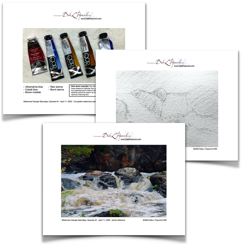
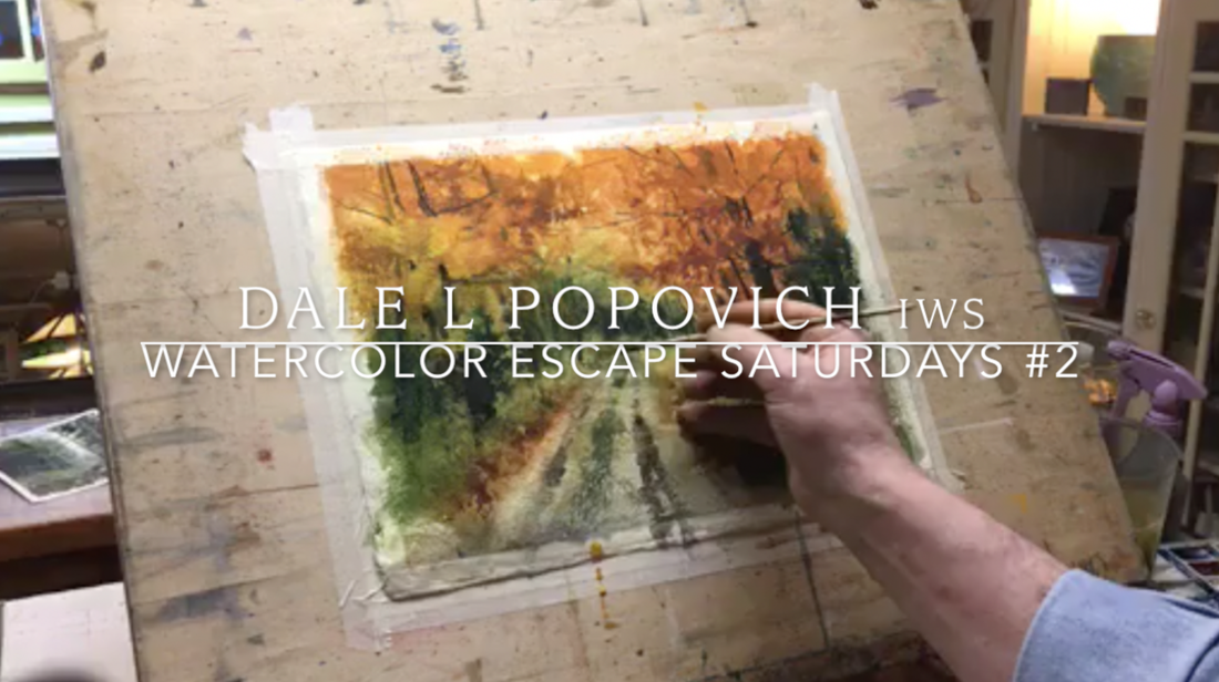
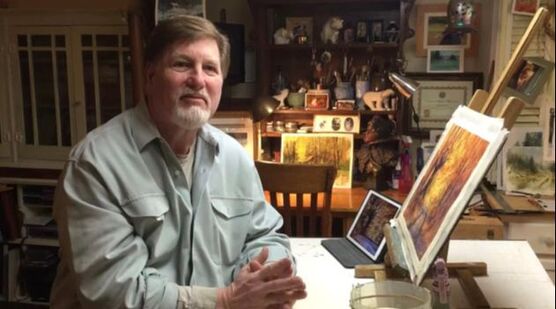
NOTE: THIS VIDEO WAS FIRST BROADCASTED ON MY FACEBOOK PAGE. BECAUSE OF THE INTERNET AND BAND USAGE THE IMAGE GETS BLURRY. SORRY. I had my fourth Watercolor Escape Saturday last weekend on April 11th. If you are new to this my wife, Marilee and I are committed to broadcasting a Facebook Live every Saturday at noon CST till our lives kinda get back to some type of normal. We want to offer an escape even for an hour or two. Reference In this week's blog post I have included the video now on YouTube (edited as a paint-along) and my demo notes. Here's what you will find:
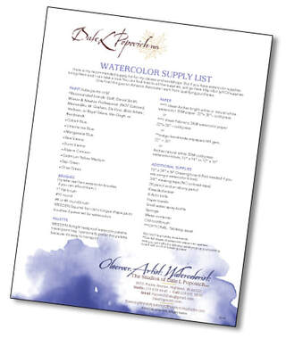
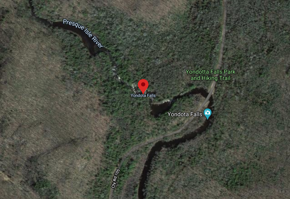
To learn more about my brushes and tried and true supplies head over to my Supply List & Library page. Click on the Supply List above for my personal printable list. The Video We have edited and added more information to the Facebook Live video. Click on the button and head over to my YouTube page. Don't forget to subscribe to my page. and leave a comment. The Painting A few weeks back one of my online watchers asked if I would do some rocks. So I thought I would paint rocks with a waterfall showing them how to recompose a photo and leave out the unimportant and how one could be left with the essentials of the photo. My main goal of this painting was not only the rocks but how to handle the water flowing over and around them. How layering the watercolor and the colors themselves could be applied to have the illusion of the water flowing over the rocks and moving down the falls. In finishing the waterfalls I used a razor blade to create the spatter of water and get a better feeling for the overall movement of the water. I spent a little bit more time back in the studio after the Facebook Live broadcast. I added some key values and colors to push the water out towards the viewer. I also took the liberty of adding gouache with color added to give a little bit more volume and dimension. 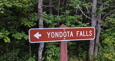 The Location Yondota Falls in the UP of Michigan. MAP. The falls are located deep in the forest of Marenisco Township, MI, and are part of the Presque Isle River. Yondota Falls is a short walk from Copps Mine Road at the bridge over the Presque Isle River. The dynamics of the water flowing are ever-changing almost like a fine bottle of wine from year to year. No two years are alike. We have been hiking there for nearly 13 years during all four seasons. During that time the water is stained with tannic acid from the tamarack trees giving the water a weak coffee color. Yandota Falls is a series of falls, so be sure you walk far enough to see them all. The trail is not long but does drop in elevation along the river, so the uphill return hike may make this a moderately difficult trail.
I have supplied additional websites below with more information I depend on and great photos to help you plan your trip look below. https://www.uptravel.com/attractions-2/waterfalls-of-the-u-p/ https://www.fishweb.com/maps/gogebic/waterfalls/yondota/index.html
In Conclusion That's it for now. I hope we will see you next Saturday at noon CST on my Facebook page for another Watercolor Escape Saturdays. Remember to leave a comment below, tell me what you think and what you would like to see in the future. Wash your hands and your brushes, Dale Note About Copyright
During this last broadcast of Watercolor Escape Saturdays, I was asked about copyright of these paint-alongs. You have permission to use and paint these reference materials. But you don't have permission to use it as a teaching tool to instruct others. In addition, your finished painting cannot be used in an art competition or show. This is solely used as a learning tool. AFFILIATE DISCLOSURES Amazon: As an Amazon Associate, I earn from qualifying purchases. Blick Art Supplies: I earn a small commission from qualifying purchases. Well, I had my second Watercolor Escape Saturday last weekend on March 28th. If you are new to this my wife, Marilee and I are committed to broadcasting a Facebook Live every Saturday at noon EST till our lives kinda get back to some type of normal. We want to offer an escape even for an hour or two. In this week's blog post I have included the video now on YouTube (edited as a paint-along) and my demo notes. Here's what you will find:
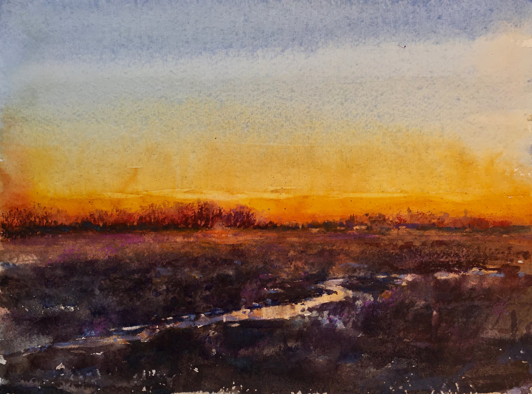
Gallery of Work Highlighted in Video Below are several demos I did playing with composition and value studies before the final painting titled Walking in My Father's Footsteps. I also share additional paintings in the video. Click on the painting to see a larger version. Gift Every year I paint a special birthday card for Marilee. I remember once a long time ago we went to the Terra Museum to John Singer Sargent watercolor show. Sargent would paint special gifts for his sister with tender words and well wishes. They were touching and moved both of us. This painting is of one of our favorite walks in spring up not far from our cabin. The silver light and tender greens you only see during this time of year. This study was painted on handmade paper containing seeds, leaves, and stems. The paper had very little sizing so planning my brushstrokes were essential. Could not rework once the paint was laid down. Final studio painting I promised myself I would experiment with new color combinations during this down time. Here is an example a new color combination palette. And don't think you can't find painting reference material. This was taken by Marilee while we were driving north through Wisconsin to our cabin. The sun was setting, the sky was on fire and the earth was rich with color. Here's my 6-color full palette:
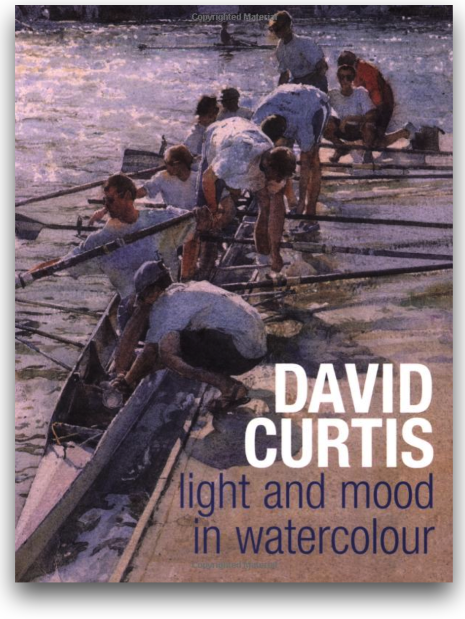
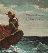 The Master I have enjoyed Winslow Homer watercolors long before I ever picked up a paint brush. My father admired his work and would share his paintings with me. He would break composition rules and make them work. I suggested a Homer book that looks like it's out of print but you may find on Ebay. There are other Homer books at Amazon (CLICK HERE) like this one. If you rather go to your library and check-out a book. Also here's a website to view. CLICK HERE. 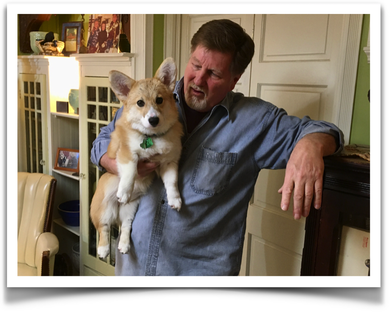 Poppy Incase you didn't here we got a new puppy this year. Her name is Miss Poppy, a Pembroke Welsh Corgi and she is such a joy. It's a blessing to have her and an additional heartbeat in our house. Well that's it for now. I hope we will see you next Saturday at noon EST on my Facebook page for another Watercolor Escape Saturdays. Remember Leave a comment below, tell me what you think and what you would like to see in the future. Wash your hands and your brushes, Dale AFFILIATE DISCLOSURES
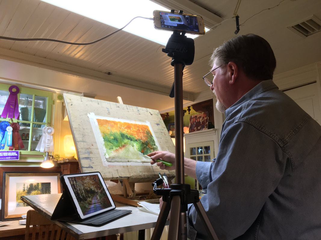
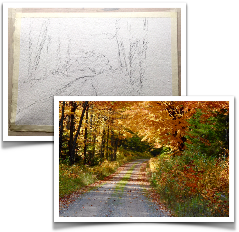
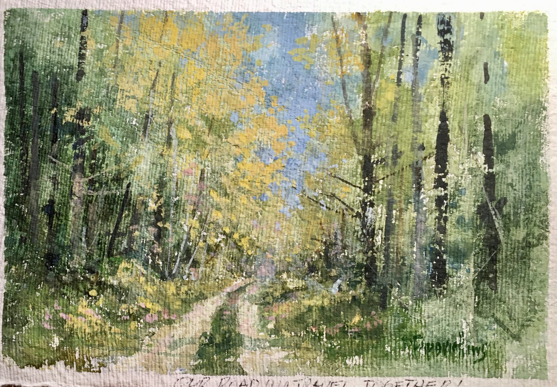
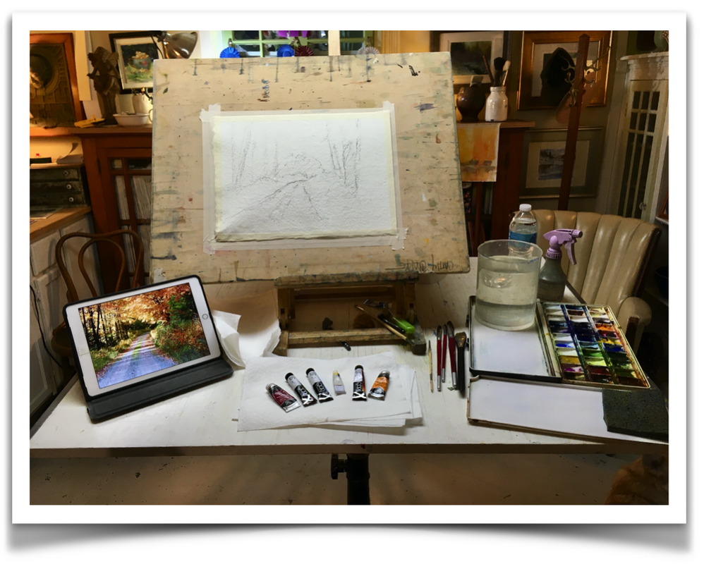
Amazon: As an Amazon Associate, I earn from qualifying purchases. In May I was invited to hold a full-day workshop for the Lakeland Art League in Minocqua, Wisconsin. Spring had come late this year up north just like in the Chicagoland area. Normally the lilacs are just starting to come into bloom and the trees are budding out in the most beautiful tender green. This year the lilacs were a week behind and the hardwoods on our property at our log cabin were still bare. I could tell the members were excited to get out, shake off their cabin fever, and learn something new. My thoughts while preparing for this workshop was to have the students get right into the painting. That meant not drawing on the watercolor paper, but instead, do the drawing with the paint brush. I also was introduced to QoR Watercolors earlier this year at the Watercolor Society of Indiana. I wanted to share with my student this beautiful, full pigment paint which is a relatively new brand. I didn't have QoR included on my supply list when I was booked for this workshop but I do know. I have a full review in an earlier blog post. CLICK HERE TO READ. I first spent a little time lecturing on patterns of values and colors – looking for the abstract shapes first before picking up the brush. From there I asked them to gather around while I started a step-by-step painting demonstration in values and colors. Step #1 began with large bold washes working wet-into-wet allowing the watercolor simply to flow across the paper. This is the unique beauty of watercolor letting the colors mix on the paper. This is something that cannot be achieved in oils or pastels. I then let my students go back to there easels and recreate what I had first done. Step #2 I approached the painting by cutting out shapes of the foliage and smaller areas so that it would start defining the subject matter. Step #3, the final phase, I put in the tree trunks where they actually belonged according to the patterns that were previously painted. The students follow along really quite well. I thought they adapted to this process nicely. The afternoon demonstration was of Pioneer Creek. This lovely little piece of Heaven is nearby our log cabin. It's one of my favorite places to just study the colors and textures – enjoy the beauty of the Great Northwoods. For this painting, I had them do a drawing as a guide. Usually, the painting can be broken down in three steps, but for this demonstration, I broke it down into five steps because it’s easier for the students to follow along. What never ceases to amaze me is how each student working with the same photo reference ends up with a little different painting. I always judge their painting in its own frame of reference never by the reference alone. Everyone had a good time learned a lot and came out with two paintings. I raffled off one of the demos and the other was donated to Lakeland Art League for a charitable cause.
Thank you LAL. hopefully, I will see you this fall. AFFILIATE DISCLOSUREAmazon: As an Amazon Associate, I earn from qualifying purchases. I want to thank the Lakeland Art League in Minocqua, WI for the fantastic opportunity this past Wednesday, January 2. This is a large group of passionate artists in the Northwoods of Wisconsin. The watercolor workshop went very well, and the students were great! I was impressed with the enthusiasm and the final paintings. Oh, and the heartiness of these artists fighting the frigid temps and snow. This eager group of artists wanted to focus on snow and pines. I demonstrated a snow scene in the morning working through the three phases of a transparent watercolor painting. Working light to dark, background to foreground and warm to cool. After we broke for lunch, we started the second painting – a paint-along. I feel this is a great way to have the students learn watercolor in small doses. In my experience, the student retains the information they have learned. We talked colors and which brushes to start with. This is a block-in stage, so a big brush is a key to your success. I painted the first phase, and then the students went back to their easels and recreate the first phase. I always walk around and give personal direction with every student. I took the students through phase-two which takes twice as long as the first. I walked then through the difference of winter verses a spring or summer. The sky is different, bark on the trees and overall light. Phase three you really slow down, and now they can go in and use smaller brushes. This is the final stage where you focus on the details. I always feel an accomplishment when I take the tape of the painting. This clean edge gives you a sneak peek of what a mat will look like on your painting I raffled off my demonstrations at the end of the day. Here are the two winners. I would like very much to be included in your schedule this spring/summer. Thank you.
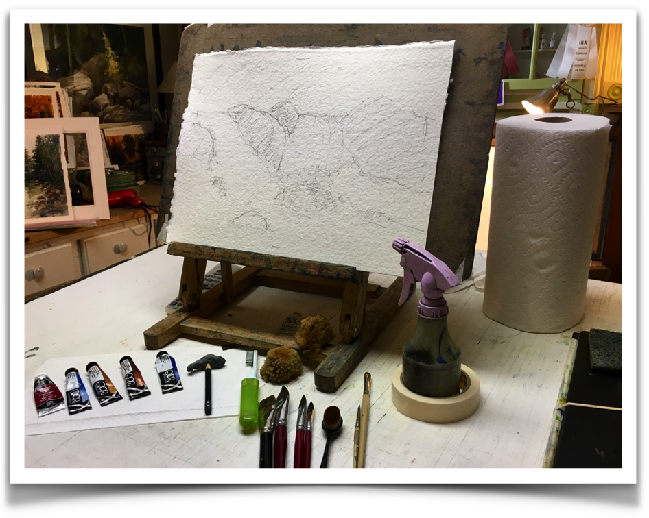
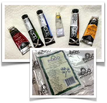
I started this demo off with Indigo paper which is around 240 lb. It has a handmade feeling with a nice rough texture to it. It’s a softer paper, so you have to be careful when lifting—you have to use a soft brush. This full-day workshop was crafted into three demonstrations. I wanted to share the differences of watercolor papers and how to chose your subject material that best suits the watercolor paper. As far as paints I explained to my students what you get out of a limited palette versus a full color. The first two demos took around 45 minutes. Finally, I like to have paint-a-longs because the student catches on faster by watching and then doing rather than just observing. This way I can guide them through the painting and help them through the process.  MORNING Demo #1: I started this demo off with Indigo paper which is around 240 lb. It has a handmade feeling with a nice rough texture to it. It’s a softer paper, so you have to be careful when lifting—you have to use a soft brush.
- Raw sienna - Ultramarine blue The limited color approach showed the students using this color palette they could create the illusion of full color. Demo #2: I switched over to 300 lb Arches hot press. It is a smoother and slicker paper. Lifting the paint is easier with this paper. This was a full-color study (note: full color is denoted by six color or more.) Adding just two more colors showed just a hint more variety of colors and helped accentuated temperature changes. Full color:
AFTERNOON The Paint-A-Long: The afternoon demo was on 300 lb Arches cold press. This paper has a rougher surface and can take a good scrubbing. I felt the subject matter lends itself to it – the roughness would add an extra dimension. Finally, I firmly believe in the paint-a-long when teaching students. It’s a step-by-step instruction of how to build a painting. I selected a snow scene to help my students understand how temperature worked with the white of the snow.
Checkout the great job my students accomplished in just one afternoon. Thank you Next Picture Show for inviting me to your beautiful gallery.
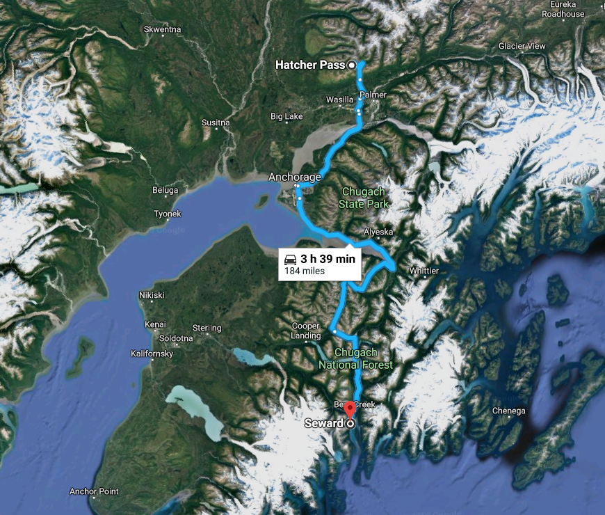
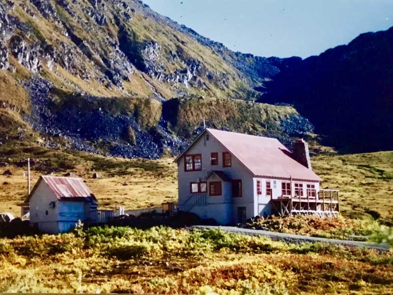
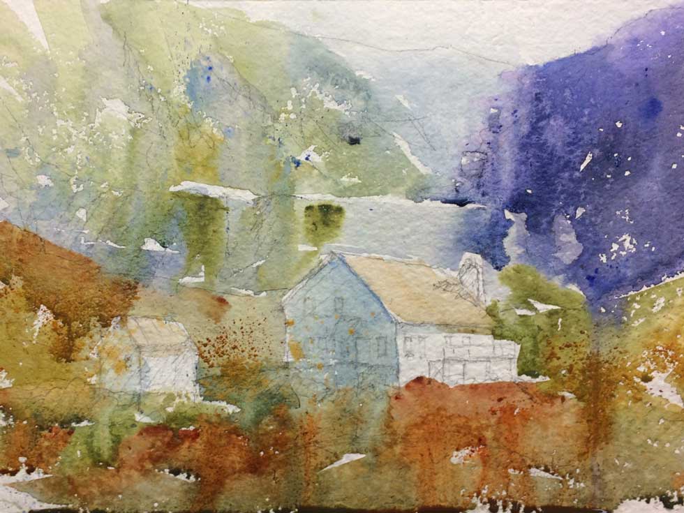
How to Block-In and Cover the Whole Sheet in the First WashThis was a watercolor demonstration I did for my Mainstreet Art Center Wednesday morning watercolor class a few weeks ago. I have a great group of students, a mix of beginners and intermediates who truly love the process of learning and creating watercolor paintings. From start to finish I took approximately 1-1/5 hours of painting/lecture time. The point I wanted to drive home to my class was to be fearless and lay color down, blocking the entire sheet in the first wash. I have my students work with one-quarter of a sheet of watercolor paper till they build up the confidence and experience for a larger painting. This particular painting I used Kilimanjaro 300 lb. cold-pressed off-white natural paper. This is an excellent paper to work with. I have had a lot of success instructing my students with a paint-along demos. This way they watch what I do in step 1: the block-in and they then can recreate it while I am with them answering questions. I remember there was nothing more frustrating to watch my instructor create a painting from start to finish and then turning us loose, try to recreate the same painting or subject matter later that day and forget how he handed the block-in, establishing secondary masses and the final details. The Photograph The photo I used for this watercolor painting was taken during a ten-day trip with my brother, Lee, his wife, Margo, and Marilee. We flew to Alaska around the end of August 2006. We decided to drive through the interior of Alaska instead of a cruise. This way we could experience all the sights, textures, and get an intimate view of the local color. We landed in Anchorage and traveled south to Seward enjoying this coastal town and spending the night in a quaint log cabin. The next day we took a daylong cruise and was totally in awe of the fjords and icebergs. From there we headed back north to Anchorage for the State Fair, Farmer’s Market, and the Anchorage Museum to see the works by Sydney Laurence, American Landscape painter. Then north to Wasilla and Fishhook. This was a portion of our trip. Denali and our plane trip around Mt Mckinley is for another time. This image was taken up by Hatcher Pass in early September which was during the peak of their autumn at an abandoned gold mine.. We took a beautiful drive along Willow Fishhook Road and then Hatcher Pass Road to get there. In fact this was one of the last pictures I took with my trusty Minolta film camera. Shot 20 rolls of film. Marilee shot over 2000 with her new Nikon D200 DSLR. Hatcher Pass is a mountain pass through the southwest part of the Talkeetna Mountains, Alaska. It is named after Robert Hatcher, a prospector and miner. To learn more about Hatcher Pass CLICK HERE. Step #1: The Block-In I started with a pencil drawing lightly, sketched onto the watercolor paper. I recommend a 2B pencil. Don’t go crazy drawing every detail, just lay down the basic shapes making sure your perspective is spot-on. Get it right in the pencil drawing because it will be very difficult if near impossible to correct later. I shared with the students how to block in this particular subject matter with the background coming to the middle ground and then the foreground. I painted around the buildings at first. Then went into the buildings to cover the painting completely. The colors used were:
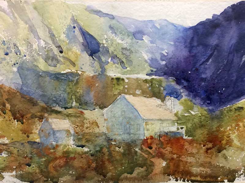
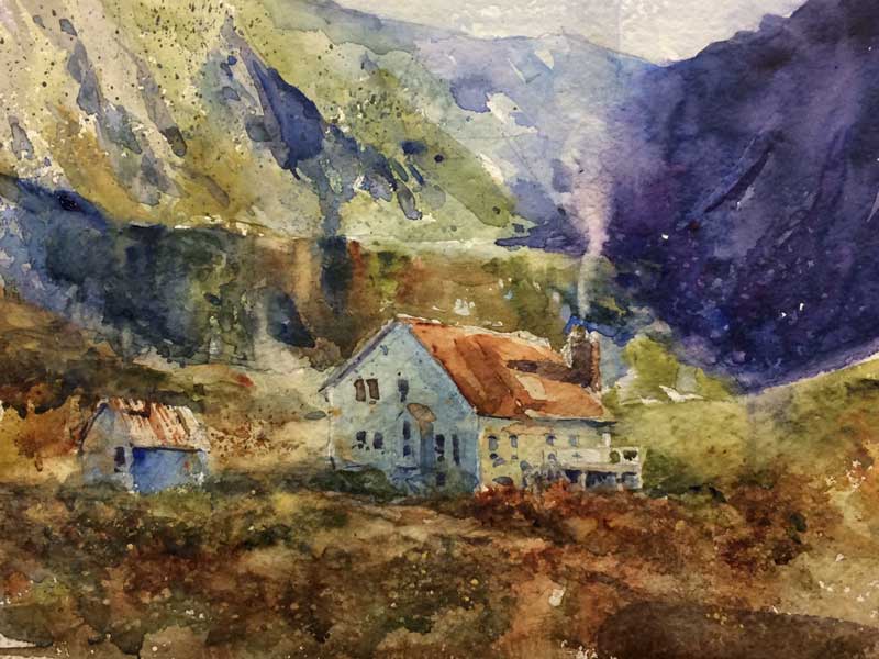
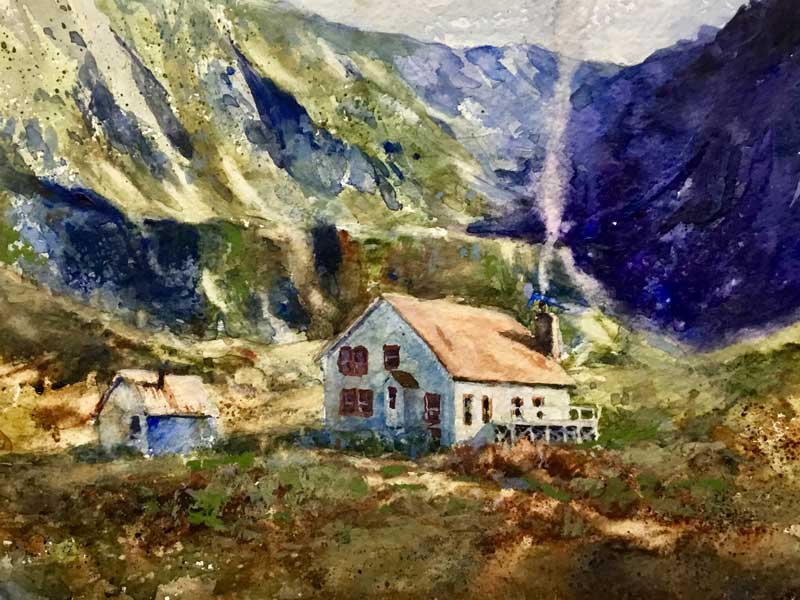
STEP # 2: Establishing Secondary Masses The second pass at the painting I went back to the mountains in the background starting to form the secondary shapes and areas coming towards the foreground and the ledge behind the buildings. I then went into the foreground trying to keep the background cooler and grayer and the foreground warmer and more intense. Altering the temperature in your painting helps you with aerial perspective. STEP # 3: Slowing the Process Way Down – The Final Details The third phase of the painting I started to develop the background to show more changes in value and modeled the slopes softening the middle area of the mountains. Then I came down to the ledge directly behind the buildings and began modeling the darker darks within that ledge to separate it from the background. I start to develop highly textured areas in the foreground. Working into the building, establishing value changes from the light side of building to the dark side, the cast shadow created by the building, and a small path for interest. I continued adding some of the detail in the building with windows, smoke coming out of the chimney, and a little bit more detail on the building off to the left. Finally, I went back to the mountains, adjusting values to create some sort of interest in the dark areas off to the upper right. Again revisited the slopes off to the left, modeling a bit more, recreating the carved out earth during the gold rush times. I then began pushing a little more intense color and darker values alongside the ledge in the background to push the building forward. I lighted in the roof of the building through lifting to push it forward from the background. From there I began to model the front deck of the building, the side protrusion from the building and darkening the windows were needed. Adding small accents of darks to the path, out in front on and around the building itself. This completed the demonstration.
|
Dale L Popovich IWSDale is an award-winning watercolorist and teacher passionate about capturing the raw beauty of the American landscape with the fluid stroke of a brush. As you will see, the works selected in his portfolio represent the depth of his holistic approach to painting. You can also learn with this talented and experienced teacher through his workshops, Palette & Chisel, and Popovich Studio classes. Archives
April 2024
Categories
All
|
|
INSTRUCTOR
Palette & Chisel 2024 Workshops & Demos ONLINE LEARNING Watercolor Escape Saturdays TIPS and TECHNIQUES Thursdays ZOOM Palette & Chisel Academy of Fine Arts ADDITIONAL INFORMATION Popovich's Field Journal Newsletter WATERCOLOR ART SUPPLIES Watercolor Paints Watercolor Brushes Watercolor Supplies DALE L POPOVICH IWS LIBRARY Books & DVDs BUSINESS BOOKS LIBRARY Books & Podcasts |
©2024 Dale L. Popovich. IWS, Drawing & Painting TIPS and TECHNIQUES Thursday, In the Comfort of Your own Studio tm, Towering Winds Academy of Fine Arts tm, and Teaching People to Truly See tm All Rights Reserved.
|
|
©2024 Dale L Popovich, Towering Winds Academy of Fine Arts and The Studios of Dale L Popovich IWS. All rights reserved
Copyright © 2024 Rosemary & Co Artist's Brushees LTD |

Handmade and maintained by POPovichDESIGN
[email protected] |







 RSS Feed
